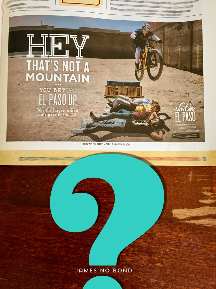
Is this the best the people responsible for attracting tourists to El Paso can do?
I found an insert in todays El Paso Times promoting tourism to various Texas cities large and small including our fair city of El Paso.
Naturally I wanted to see what amazing ad represented our shining city and lo and behold…
an ad promoting our magnificent Franklin Mountains State Park as an epic challenge for mountain biking enthusiasts…without any visual reference to our majestic mountains. Just some empty, barren, dirt lot with some guys performing some 70s Evel Knievel stunt.
I am a visually oriented graphic designer with 33 years experience in advertising and design under my belt AND EVEN I HAD TROUBLE DECIPHERING THIS MESS.
Most readers will not give it 5 seconds if they can’t figure out what the message is within that time frame but me being visually curious gave it much more than that.
Would you advertise the Niagara Falls by showing a photo of a drainage ditch with some water spilling over the edge and a paper boat floating by?
Would you advertise Las Vegas with a photo of a kid pulling the handle of a toy slot machine with mom’s meat loaf dinner in the background?
Well we did just that with this lame ad that is supposed to get people excited about visiting El Paso to ride the Franklins with no clue as to what the Franklins look like.
HEY…THAT’S NOT AN AD.
• • • • • • •
wanna see some real design and concept promoting El Paso?
visit my website at judburgess.com

